Friday, 22 March 2013

Amazinggg Drawn Illustrations By Si Scott

Well, Si Scott is a full-time artist, designer and
creative consultant based in the UK.


   He’s renowned for his unique style, blending hand-crafted and hand-drawn artwork that has gained him numerous awards and a prestigious client list. So far in his career he has completed projects for Matthew Williamson, Vogue, Nike, Tiffany & Co and Sony to name a few. As well as contributing to advertising campaigns for Guinness, Absolut and American Express.


   Si has recently taken time out to develop his skills further. Challenging the 2D perspective of his work by rendering his hand drawn creations in 3D form.
A visiting lecturer at Leeds College of Art & Design on the 3rd year BA Hons degree in Visual Communications, Si has given talks and exhibited his work at institutions in cities around the world including Tokyo, New York, Brazil and Sydney. He has also been involved in judging for the D&AD and Scottish Design Awards among others.


   Beyond design and lecturing Si is available in a consulting role. His experience, skills and knowledge mean he is able to give guidance and contribute to a wide range of projects.


fish Incredible Hand Drawn Illustrations by Si Scott


 Are you thinking what I'm Thinking ? Graphics drawn on software. Well Even I thought the same. You know what these are hand drawn..Unbelievable !! It's incredible.

Thursday, 21 March 2013

Creative Logos With Hidden Symbolism Part I

Hi, Folks 
Today I've got collection of Logos with hidden symbolism in them. 

Well I gues most of us know what logo is 

Just a small defination What is logo
   A logo is a graphic mark or emblem commonly used by commercial enterprises, organizations and even individuals to aid and promote instant public recognition. Logos are either purely graphic (symbols/icons) or are composed of the name of the organization (a logotype or wordmark).

All Logo designers out there this could be inspiration for you guys for future or upcoming designs. 


1) Circus of Magazines
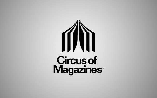
 

Seriously this clear and perfectly designed by taking into consideration the name i.e. Circus of Magazines.Circus tent looks like a magazine (more like a book to me, but still very clever). (Designer:logotomy)

2) Formula 1
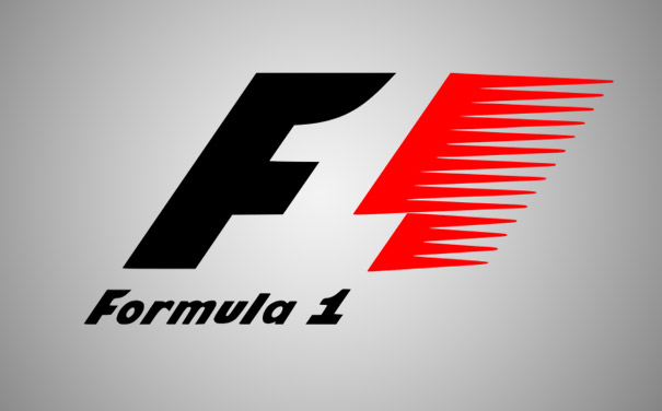


Empty space in the middle creates a number “1″ for “Formula 1″

Formula One, also known as Formula 1 or F1 and referred to officially as the FIA Formula One World Championship, is the highest class of single-seater auto racing sanctioned by the Fédération Internationale de l'Automobile (FIA). The "formula", designated in the name, refers to a set of rules with which all participants' cars must comply.The F1 season consists of a series of races, known as Grands Prix (from French, originally meaning great prizes), held throughout the world on purpose-built circuits and public roads.


Formula One, more commonly known as F1 or Formula 1, is the highest class of single seater auto racing championship organized by the Fédération Internationale de l'Automobile (FIA).
One of the most popular sports events on the globe, 2010 FIA Formula One World Championship was watched by a huge audience of around 527 million people around the world.
The current Formula One logo was designed in the early 2000s.

DESIGN ELEMENT OF FORMULA ONE LOGO


Shape of the F1 Logo: 
The F1 logo is one of the most famous and creative sports logos ever created. The negative space in the middle of the logo creates the “1″. The F1 logo is brilliantly relevant to the brand and communicates its essence, i.e. speed and energy, in a highly effective yet aesthetically pleasing and energetically well-integrated manner.
Color of the F1 Logo: 
The F1 logo features red and black colors on a white background. The red color represents passion and energy, while the black color represents power and determination.


3) FedEx
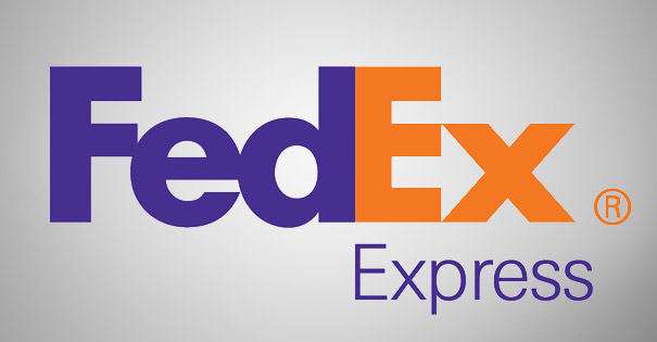


 If you look closer you’ll notice the right-pointing arrow in between the ‘E’ and the ‘x’, representing precision and speed at which FedEx works.

FedEx Corporation, originally known as FDX Corporation, is an American global courier delivery services company headquartered in Memphis, Tennessee. The name "FedEx" is a syllabic abbreviation of the name of the company's original air division, Federal Express, which was used from 1973 until 2000.

The original "FedEx" logo had the Ex in orange; it is now used as the FedEx Express wordmark. The FedEx wordmark is notable for containing a hidden right-pointing arrow in the negative space between the "E" and the "X", which was achieved by designing a proprietary font, based on Univers and Futura, to emphasize the arrow shape.

FedEx Logo Evolution and Facts:
The most interesting fact about the FedEx logo is that it creates an optical illusion; if you observe closely between the ‘E’ and the ‘X’, you’ll notice a presence of an arrow there. The arrow represents the speedy and accurate service of the company. The arrow was formed after 200 FedEx logos were already designed and reviewed by Lindon.
The ‘Ex’ in FedEx signifies different sectors of the company in different colors. FedEx Express in Orange; FedEx Freight in Red, FedEx Ground in Green, FedEx Kinko’s in Blue, FedEx Trade Networks in Yellow, and the FedEx Services in Grey. In addition, the ‘Ex’ of the corporate logo is also colored grey.
The earliest FedEx logo was designed in 1973 by Richard Runyan.


4) Bipolar
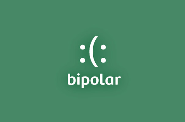
 

 The Logo depicts ambiguous emotions. It exactly matches the logo. The meaning of bipolar is  
 -Relating to or having two poles or charges
- Having two opposite or contradictory ideas or natures (Designer:Siah Design)


5) Amazon


Many of us know this site very well. Because most of us do purchase many stuffs on this site from clothing to books and many more.

The arrow from A to Z, symbolizes what Amazon is known for selling everything from “a to z” . It also serves as a smile, making the company feel friendly and approachable.

Well it's more....

Amazon.com, Inc. is an American company that is widely considered to be a groundbreaker in the online retailing business. Established in 1994 by Jeff Bezos, Amazon.com started off as an online book store, and was named after after the world’s largest river. The company soon expanded, selling thousands of items from computer software to home furniture.
Headquartered in Seattle, Washington, Amazon.com is the biggest online retailer in the US.

DESIGN ELEMENTS OF AMAZON LOGO


Shape of the Amazon Logo:
Amazon.com has used several logos over the years. The current Amazon logo depicts the absolute message that they sell everything from A to Z. In addition to that, the arrow below the wordmark visualizes the smile that the customers of the company would experience by shopping on their website.
Color of the Amazon Logo:
The black color in the Amazon logo represents dominance, supremacy and elegance, while the orange color stands for pride and happiness.

Well these logos were pretty amazing. Well I'll post soon post part 2 of these. So keep watching..O_O
Please do post in your comments about the content of my blog.

Wednesday, 20 March 2013

Amazing Eco Wall Stickers by Hu2

Hu2 

 Hu2 represents the core element of creativity: " Human, 2 Kinds ". Antoine Tesquier Tedeschi is the founder of Hu2 

Hu2 has been awarded the Best Design Concept 2010 and nominated at the Best of Green Award 2010 by TreeHugger.

  Hu2 Design was created in 2007 in the cold East London of Shoreditch. During its journey to its Paris based studio, Hu2 has not only created an illustrative style that is today the brand's trademark, we have also given wall design and wall stickers a purpose within the household. This has resulted in series of story-telling eco reminders and signage related home decals, wall signs and home accessories for decoration. We thrive on Interactive Design, and there is no better satisfaction for us than in making information look beautiful.

 Let's look at some of the amazing Eco Wall Stickers...

Franklin's Kite sticker

Franklin's Kite Sticker

Antoine Tesquier Tedeschi aka Tes-Ted
- Founder of Hu2 Design -
Born in Paris in 1985, Antoine has worked in Miami, London and Paris for the past few years. Known as an Art Designer, Antoine wanted to deliver a product and service that was born out of the creativity and talent of those employed by and affiliated with Hu2 Design. Hu2 stands for " Human, 2 kind ", which represents the core element of creativity:
the Human Factor


SAVE A POLAR BEAR sticker

SAVE A POLAR BEAR Sticker

 This wall sticker is a quirky, decorative and eco-friendly way to remind of the importance of energy saving.Loved by creatives, approved by eco-geeks, and made in Paris, France by a multi-award winning ethical business, SAVE A POLAR BEAR sticker is the new sustainable decoration.
 
 
Motto
Original Art and Innovative Design start with very simple principles: original and crafted. We cerified all our products original and Limited edition are always supplied with certificate of authenticity and undersignedby Tes-Ted himself. We guarantee our customers with the finest decorative items made in France by our team following the concept of minimalist factor where our impact on the environment is minimize. At Hu2, the manufacturing process is fully optimize to re-use materials and make as much as possible to keep our waste low.
 
Shower Time Reminder sticker

Shower Time Reminder Sticker


Turn Off at Night Reminder sticker

Turn Off at Night Reminder Sticker

Turn Off at Night Reminder sticker is the original wall art decal idea designed by Antoine Tesquier Tedeschi for Hu2 Design. This wall sticker is a quirky, decorative and eco-friendly way to remind of the importance of energy saving.Loved by creatives, approved by eco-geeks, and made in Paris, France by a multi-award winning ethical business, Turn Off at Night Reminder sticker is the new sustainable decoration


Before Leaving Checklist Sticker

         Before Leaving Checklist Sticker

The Before Leaving Checklist sticker is the original wall art decal idea designed by Antoine Tesquier Tedeschi for Hu2 Design. This wall sticker is a quirky, decorative and eco-friendly way to help people stop forgetting their stuff before leaving. Loved by creatives, approved by eco-geeks, and made in Paris, France by a multi-award winning ethical business, Before Leaving Checklist sticker is the new sustainable decoration.

These Eco Wall Stickers are pretty amazing. How about you ? Did you like it ? Well have one soon...If you like to purchase these Sticker do visit thier website and for other collection as well.http://www.hu2.com/
They have plenty collections on their website.
Source: http://www.hu2.com/


Tuesday, 19 March 2013

Amazing Snow Art by Simon Beck

Simon Beck    

   Originally an orienteering mapmaker, 54 years old Simon Beck  from Southern England, educated at Millfield School and Oxford University, got fond of expressing himself through gigantic snow “crop circles” look art. It all started once he bought an apartment in  Les Arcs, French ski resort in 2004. Each creation takes around 10 hours of walking in snowshoes and covers a significant piece of frozen lake sometimes even size of 6 football fields.

     The artist usually draw the design on a piece of paper before starting and as soon as he ready the only thing he is using outside is the  handheld orienteering compass and pace counting or measuring tape, so he can determine the distance and set out the work. Beck usually gets inspired by world of geometry or “crop circles”, which he developed gradually through years of performing the snow art.


      The artist behing behind the amazing snow art.


Creative Graphic Posters by Kapil Bhagat

   Kapil Bhagat creates some graphic based upon important event related to the day, about India or if  any internationally observed day. Or any random illustration.

    For example, Newton drops an “O” to illustrate gravity, a massive “C” in Copernicus reminds us that he figured the Earth wasn’t the center of the universe and placed the Sun, rather than the Earth, at the center. Not only do the posters look great, but they also allow you to memorize who did what.


Monday, 18 March 2013

Creative Hooks

Wall hook probably doesn’t sound like something very cool, but we have 15 serious arguments to prove otherwise!


1) Paint Brush Wall Hook

Paint Brush Wall Hook

 We first fell for artist and designer Dominic Wilcox last year at the Milan Furniture Fair with his living shoe laces exhibition. But more recently, the designer has created an installation of coat hooks, recycled from old paint brushes. 

  "One day Dominic was walking through an art shop and looked at the brushes. They seemed pleasant objects so he decided to come up with something using one of them. He remembered how he used to forget to wash paint brushes after using them and then would find them hard and unusable the next day. After quite a few trials and mistakes he managed to make something useful, a coat hook. Handily there is a hole at the top of the handle for the screw."

2)Fly

Fly

Little butterflies flying out of a magic hat. Well this looks pretty amazing on the wall. It looks like some decorative piece on the wall. Well nice hook to hang all you stuff like coat, hat and other stuff. Pretty cool.(Designed by Lamidea)

3) Bird Hook

Bird Hook

   A ceramic hook in shape off a bird where you can expose your favorite accessories. (Designer: Jantze Brogård Asshoff)

   Jantze Brogård Asshoff is a design studio located in Stockholm, Sweden, founded by Moa Jantze, Hanna Brogård and Johanna Asshoff. 

  We strive to beautify and simplify our surroundings to improve everyday life. We create sophisticated, useful products with a poetic soul and playful character. Our backgrounds from diffrent parts of Sweden will always be a great source of inspiration. We like to mix modern with traditional, folklore with decadent luxury and regional Swedish handicraft with industrial production.


4) Alone Hook
Alone Hook
   Alone, an "illuminated circular outline", a coat hook that casts an eye at the concept of a wall light.
Its clear-cut, linear design is enhanced at the rear by an opal finish ring that fills with white light creating a bright halo focusing on the hanging garment.

    Alone can be used in various ways - on its own, in a row or randomly scattered - contributing with its light to outlining visual and functional paths, while furnishing and enhancing also the narrowest and dimmest corners on the home. Dessigned by Daniele Trebbi.

5) Man Wall Hook
Man Wall Hook
Men wall hooks will certainly provide uniqueness with its outstretched forms. Made up of high class cast resin, the stretched arms and legs will give a gymnastic comfort as a hanger for your coats, hats or even towels.

6) Ninja Star Coat Hook
Ninja Star Coat Hook

Ninja Star Coat Hanger will definitely let you attack on your own home walls. No, here it’s not the defending part; instead, this star hanger will act as your weapon tool to hang out your coats, hats or belts.


7) Dart Hook
Dart Hook
Make a playful statement in your wall! Set of three Stainless steel darts with a special wall fixing. A unique hook for hanging your favorite hat or jacket. (Designer: Anthony Chrisp)

8) 8-bit Hanger


8-Bit Hook
Mount to your wall, and then use to hang your non 8 bit stuff. You can hang on your stuff like headphones, hat, and other stuff.(link)

9) Raindrop
Raindrop Hook
Wooden raindrop wall hooks. (Designer: Jantze Brogård Asshoff)

Jantze Brogård Asshoff is a design studio located in Stockholm, Sweden, founded by Moa Jantze, Hanna Brogård and Johanna Asshoff. 

  We strive to beautify and simplify our surroundings to improve everyday life. We create sophisticated, useful products with a poetic soul and playful character. Our backgrounds from diffrent parts of Sweden will always be a great source of inspiration. We like to mix modern with traditional, folklore with decadent luxury and regional Swedish handicraft with industrial production.

10) Knife Hooks
Knife Hook
Show your character by making your home look like a war zone. (Designer: tc studio)

TC STUDIO IS THE EXPERIMENTAL
DESIGN SPACE OF TI CHANG

Hi, thanks for checking out my work. I'm an industrial designer / entreprenuer who has a full time job but on occasion I enjoy designing and creating not because it pays the bills, but simply because it nurishes my soul.

As an industrial designer, I work in mass prduction and volume manufacturing sometimes it is refreshing to create small batches of personal work. This is a space where you can find one-off items or products made in very limited quantities. Hope you will enjoy it!

11) Regnah Hanger

Regnah Hanger
Hanger for anyone with a crazy desire to hit a door or a wall with an axe. (link)
12)  Mountain Coat Range

Mountain Coat Range
 Inspired by excess material from our cut sheets, the contrast of Walnut to the exposed interior of Certified Maple becomes the snow-capped mountain peaks of the Grand Tetons. A functional landscape for your home that leaves little impact on the actual frontier. The mountain range’s peaks enable you to hang four or more items. (Designer: BraveSpaceDesign)


13)  Office Clip Hook

Office Clip Hook
Someone finally did it—improved an everyday paperclip. It’s 10 times bigger, stronger and more contemporary, too. A great catchall for your modern office, it’s made of heat-treated steel to hold coats, bags or files. (link)

14) “Here Hook”

Here Hook

 Here’s the “Here Hook!” It’s an arrow, basically just pointing to the general area of itself. It’s a coat hook. It knows exactly where you’d be precisely in the area of cool if you want to hang up your jacket. Or hat! (Designer:Richard Shed)


15)Active Hanger

Active Hanger

 Mountain climbing posts you install on your walls, serve as both hooks for clothing, and a rock-climbing-esque wall in your house. Placed several meters above the floor, this hanger transforms the wall in a little mountain that needs to be climbed every time users have to get their jacket. (Designer: Ferran Lajara)

Sunday, 17 March 2013

Artworks with Clever Use of Negative Space

Tang Yau Hoong


Self taught illustrator born and based in Kuala Lumpur, Malaysia.
I love to play with negative space and illusion in my artwork. My illustrations are mostly conceptual, surreal and minimalist.
Since 2007, I have gone freelance working with clients globally in various fields ranging from editorial, advertising, t-shirt, poster, book cover, print and etc.
In Nostalgic Mood
Found Anything Yet?

Journey to the City of No Horizon


The Sound of Nature
Dawn
Swinging in the Light
"Creativity is Intelligence Having Fun" -Albert Einstein
 Nice and perfectly designed.
For more details log on to --> http://tangyauhoong.com/