Well, today's blog is Creative Logos With Hidden Symbolism Part II. Sorry Kept you'll waiting with part II.
So, here it is..... :)
1) Skype
Skype
is the most popular online communication service in the world with 663
million users as of September 2011. It is one of the first companies to
create a huge impact on the Internet phone market.
Founded by Niklas Zennström and Janus Friis in 2003, the company was acquired by Microsoft Corp. in May 2011 for $8.5 billion in cash.
DESIGN ELEMENTS OF SKYPE LOGO
Shape, Colors and Font of the Skype Logo:
The
earliest form of the popular Skype icon was launched in 2003. It was
based on a simple yellow speech balloon. The icon underwent several
overhauls throughout the years. The current Skype icon features the
letter “S” in white color with a bright blue background.
The
bubbly Skype logo, one of the other hand, is based on the Arial Rounded
MT Bold typeface. It features the company name on a series of circles
which collectively make a “cloud”.
The
blue color in the Skype logo represents communication, prosperity and
the emotion of hope; whereas the white color represents peace and
harmony.
2) Apple
Apple Inc.
is the one of the largest and most famous companies in in the computer
industry. It manufactures consumer electronics as well as computer
software and personal computers. The company makes
the most advanced and innovative software to give their products a
unique edge. The Apple logo is known all around the world as it brings
innovative improvisations to their products and generate the best
quality product available in the market. Apple has been in the market
since 30 years and is making its way to farther prosperity.
The
Apple logo was just not designed as an apple after a result of some
long a deep ponder, it holds a story behind it. Sir Isaac Newton, who
gave the law of gravity was once sitting under a tree and noticed an
apple fall to the ground, after which he gave the theory of the
existence of gravity. The logo of the Apple company represents the same
apple that Newton
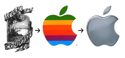
encountered. At first the Apple logo was rainbow colored which signified
the birth of colors in the world of IT. The logo is also said to be
paying a tribute to Alan M. Turing, the undisputed
father of Computer Science, who committed suicide after eating a poisoned apple.
DESIGN ELEMENTS OF APPLE LOGO
The
Apple logo is not only unique but it also carries a very interesting
background. The logo is highly visually distinctive and easy to
understand. It signifies the best quality of products.
Shape of the Apple Logo:
The
identity of the Apple Company is seen in its logo. The logo comprises
of an apple, bitten from the right, with a leaf tilted towards the right
side.
Color of the Apple Logo:
The color of the Apple logo is silver and polished, giving it a unique and modern touch.
Font of the Apple Logo:
There
have been quite a few times that a font has been mentioned in the Apple
logo, since the logo itself is self explanatory. However, if ever a
font is seen it is always mentioned in a clear and bold manner.
3) Bosch

Robert Bosch GmbH
(often called “Bosch”) is a world-renowned engineering and electronics
firm. Headquartered in Gerlingen, Germany, the company employs 303,000
people worldwide with annual revenue of
€51.4 billion as of 2011. Established in 1886 by Robert Bosch, it now
the largest supplier of automotive parts in the world.
Bosch has around 350 subsidiaries in more than 60 countries and sells products in over 150 different countries of the world.
DESIGN ELEMENTS OF BOSCH LOGO
Shape of the Bosch Logo:
The
Bosch logo depicts a magneto armature inside the magnetic casing, which
was one of the earliest products of the company. It was created in 1918
by Gottlob Honold, the main engineer in the workshop of Robert Bosch,
and modified in 2004 by Erik Spiekermann of United Designers Network.
Color of the Bosch Logo:
Having red and black as basic colors, the Bosch logo also uses gray and silver colors.
Font of the Bosch Logo:
The Bosch logo features Bosch Sans and Bosch Serif typefaces, both of which were designed by Erik Spiekermann and Christian Schwart.
4) Dell

Dell Inc. is a world-renowned global American computer technology firm, bearing the name of its founder, Michael Dell.
Headquartered in Round Rock, Texas, it is one of the world’s biggest
technological companies that employs more than 110,000 worldwide with
total assets of US$ 44.53 billion as of 2012.
DESIGN ELEMENTS OF DELL LOGO
Shape and Font of the Dell Logo:
The famous global strategic branding agency Siegel+Gale
created the first Dell logo in 1984. The slanted “E” symbolized Michael
Dell’s wish to “turn the world on its ear”. It slowly
gained popularity and eventually became one of the most memorable and
iconic logos in the technology industry. Towards the end of 2010, the
logo underwent a few changes.
The task was given to another branding firm named Lippincott, as they came up with an exclusive, tailor-made typeface for the company, “Museo”, with the help of Dutch type designer Jos Buivenga,
and moved the letters slightly to the left on both of the “Ls”. The ‘E’
was also tilted a bit more downward. The blue ring surrounded and
protected the iconic Dell logotype, giving it a graphical appearance of a
globe.
Color of the Dell Logo:
The blue color in the Dell logo represents loyalty, trustworthiness, confidence and intelligence.
5) Microsoft
Microsoft Corporation
is a leading American multinational corporation that develops
personal-computer software systems and applications. Headquartered in
Redmond, Washington,
U.S., Microsoft employs more than 89,000 people in more than 102
countries around the world.
The
company also provides e-mail services, publishes books and multimedia
titles, and distributes electronic game systems, computer peripherals
and portable media players.
DESIGN ELEMENTS OF MICROSOFT LOGO

Shape, Colors and Font of the Microsoft Logo:
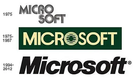
The
earliest known Microsoft logo was designed in 1975. Often called a
“groovy logo”, it was reflective of the 70′s and 80′s era, and featured
glowing disco lights. The second Microsoft logo, which was in use from
1975 to 1987, featured green color and the company name in all uppercase
letters. Also known as the “blibbet logo”, it contained a fanciful
letter
“O”.
In
1994, another version Microsoft logo was unveiled which remained the
company’s corporate logo until August 2012. The so-called “Pacman logo”,
designed by the American graphic designer Scott Baker, uses Helvetica
Italic typeface, and contains a slash between the letters “o” and “s” so
as to highlight the “soft” part of the company name and express motion
and
speed.
In
August 2012, Microsoft introduced a new logo which incorporated a
bright, multicolored Windows symbol. The four squares, consisting of the
familiar Windows colors, tend to
portray the diverse portfolio of the company’s products. The logotype was also significantly modified and featured the company name in Segoe UI
font. On the other hand, the italic fonts and the cutout on the O, two
integral elements of the old Microsoft logo, were noticeably removed.


No comments:
Post a Comment